Optimising Training Time and Reducing Computational Demands
Setting the Scene
Picture somebody performing 20 star jumps, followed by 20 burpees, followed by 20 sit ups.
Next, imagine these same exercises – however this time they are performed atop a multi-touch pressure sensing mat.
The pressure mat resembles a yoga mat, with 512 embedded pressure sensors aligned in a 32 x 16 matrix. Each sensor records a pressure reading (Kg/cm^2) against their timestamp, with a 10-20ms dynamic response time.
Every second has the potential to produce thousands of datapoints.
If we were to plot the sensor readings against time, we would expect:
- The 20 star jumps —> Rapid changes in total pressure from zero to x as the subject jumps and lands on the mat. Only a small subset of the pressure sensors would ever be triggered, concentrated around the feet.
- The 20 burpees —> Similar to the above, we would see total pressure vary from zero to x. However, a far wider range of pressure sensors across the mat will be triggered.
- The 20 sit ups —> Total pressure should never equal zero, as the subject is continually sat on the mat. We would see intermittent increases and decreases as the subject’s back touches and lifts from the ground.

The Dataset
MEx is a research level, multi-model experimental dataset that was recommended by a prior data science manager of mine to analyse.
The experiment saw 30 individuals perform seven different dynamic physiotherapy exercises on a pressure sensing mat.
Objective
The aim of my analysis is to demonstrate a beneficial application of feature selection when designing a machine learning (ML) model. The ML model will ultimately be used to predict which physiotherapy exercise is being performed, according to sensor readings. The feature selection aspect is to test my hypothesis – there are pressure sensors within the matrix which offer little to no useful information and therefore can be excluded from the model input. All while still accurately predicting the exercise being performed.
Benefits of feature selection include:
- Reduced training times
- Reduced computational requirements
- Remove irrelevant features, for example those pressure points which have never picked up a signal
- Reduce overfitting, separating the signal from the noise
Data Frame Pre-Processing
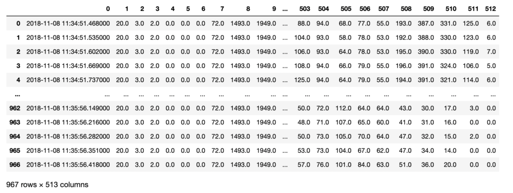
I began by reading in a few examples of the 210 .csv files to observe the data’s structure and volume. I conducted typical data quality tests and sense checks – including checking for nulls and appropriate data types.
Next, I concatenated all the .csv files into one master data frame. I engineered the following additional features to aid analysis:
- Subject –> The individual performing the exercise. This information was originally found in the folder structure.
- Exercise –> The exercise number (1-7) performed by the subject. This information was originally in the .csv file name.
- a_Time –> The actual time and date these readings were recorded.
- r_Time –> The relative time these readings were recorded.
- Total_p –> The total pressure on the mat at that point in time (sum of the 512 sensors).
I also renamed columns 1-512 into 1_1 to 32_16, to represent the X-Y coordinates of the sensor on the mat. The new data frame was checked for data quality and saved locally to aid future processing.
Code to build data frame that maintains original folder structure as new features
debug = False

#defining the root directory of the pressure mat data
pmRoot = "data/"

#timing information - start timer
start = timer()

#for subjects 1 to 30
for i in range(1, 31):

    #for exercises 1 to 7
    for j in range(1, 8):

        #read in a pressure mat data frame

        #formatting the numbers to match file system
        if(i<10): folder = "0" + str(i) + "/"
        else: folder = str(i) + "/"
        file = "0" + str(j) + "_pm_1.csv"

        #read in the .csv files
        if (debug == True): print(pmRoot + folder + file)
        pm_df_in = pd.read_csv(pmRoot + folder + file)

        #calculate the total pressure for each time increment
        pm_temp_totals = pm_df_in.drop(pm_df_in.columns[0], axis = 1).sum(axis = 1)

        #reformatting the time string into an actual datetime object
        for k in range(len(pm_df_in)):
            timeString = pm_df_in.iloc[k,0]
            if len(timeString) < 20:
                timeString = timeString + "."
            while len(timeString) < 26:
                timeString = timeString + "0"
            pm_df_in.iat[k,0] = datetime.strptime(timeString, "%Y-%m-%d %H:%M:%S.%f")

        #create a measure of absolute time for each data point
        pm_temp_a_Time = pm_df_in.iloc[:,0]

        #create a measure of relative time for each data point
        #have to do this in a for loop for some reason?
        pm_temp_r_Time = [None] * len(pm_temp_a_Time)
        for time in range(len(pm_temp_a_Time)):
            pm_temp_r_Time[time] = pm_temp_a_Time[time] - pm_temp_a_Time[0]

        #create a dataframe to store our bad boys in
        pm_temp_df = pd.DataFrame(columns = colNames)

        #add in our data
        pm_temp_df["a_Time"] = pm_temp_a_Time
        pm_temp_df["r_Time"] = pm_temp_r_Time
        pm_temp_df["Total_p"] = pm_temp_totals

        pm_temp_df[coords] = pm_df_in.iloc[:,1:len(pm_df_in.columns)]

        #label the data with the subject and exercise
        pm_temp_df["Subject"] = pd.Series([i for x in range(len(pm_temp_df.index))], index=pm_temp_df.index)
        pm_temp_df["Exercise"] = pd.Series([j for x in range(len(pm_temp_df.index))], index=pm_temp_df.index)

        #append to our dataframe
        pm_df = pm_df.append(pm_temp_df)

#         break
#     break

#timing information - end timer
end = timer()
dt = end - start
print("Importing time elapsed: {:.2f}".format(dt))

pm_df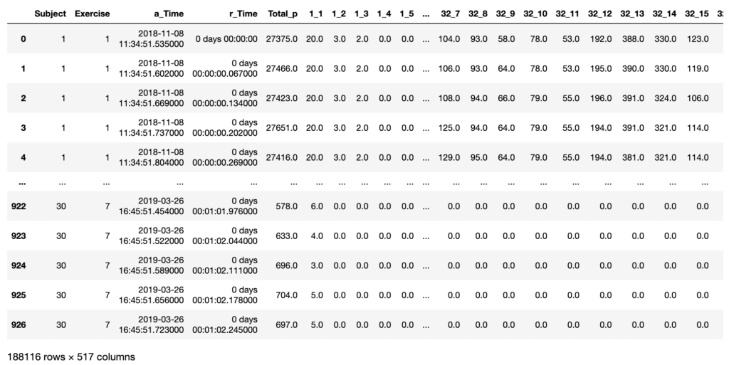
Exploratory Data Analysis (EDA)
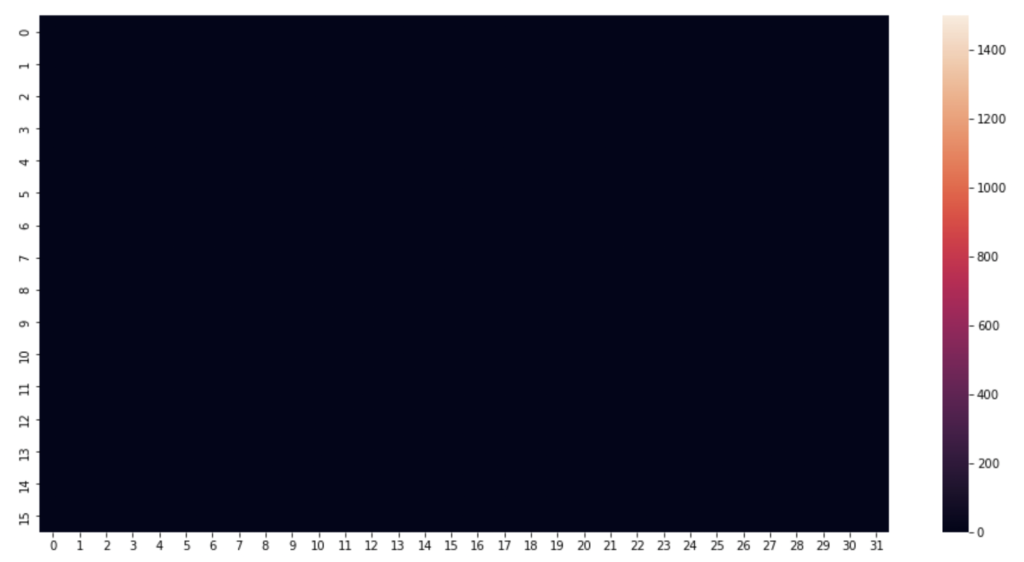
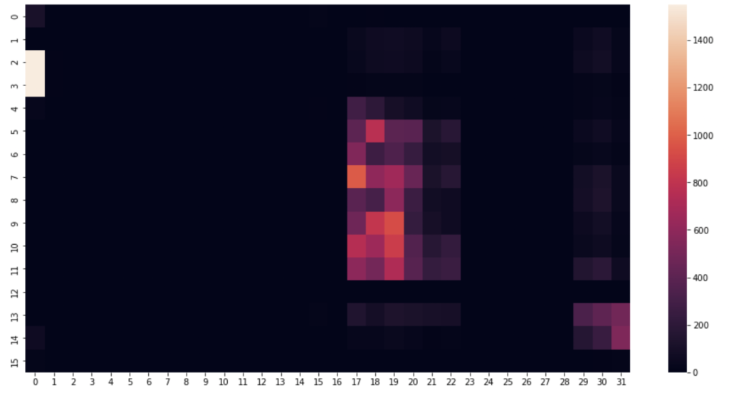
I began by picking a few timestamps and visualising their respective row of data. A heat map proves the perfect visualisation for representing pressure on a mat. This is how the pressure mat’s native software visualises pressure readings.
Code to visualise heatmat
#1520 is just a nice one, can alter the row number to anything
rowNum = 1520

#create an array using the pressure point readings in the specified row
heatmapData = pm_df.iloc[rowNum, 6:len(pm_df.columns)].to_numpy() #start from column index 6 until the end
heatmapData = heatmapData.reshape(32, 16).astype(float) #reshape the datapoints into a 32x16 grid

plt.figure(figsize=(16, 8)) #defining the size and dimensions of the graph
sns.heatmap(heatmapData.T, vmin=0, vmax=1550) #display the heatmap with defined scale
#sns.heatmap(heatmapData.T) #display the heatmap with relative scale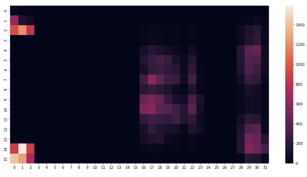
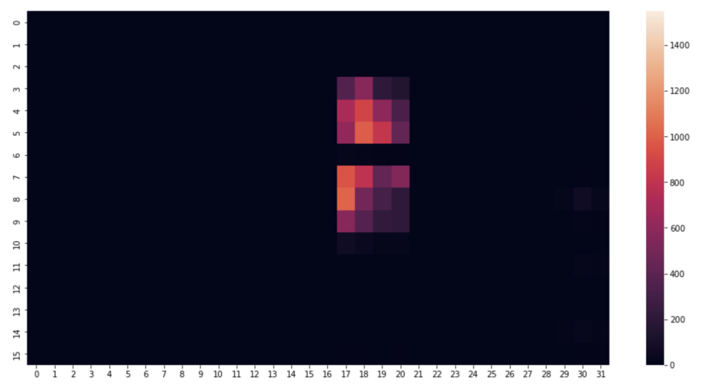
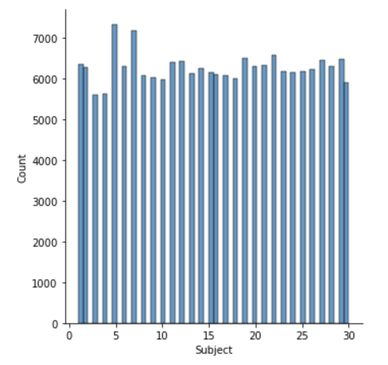
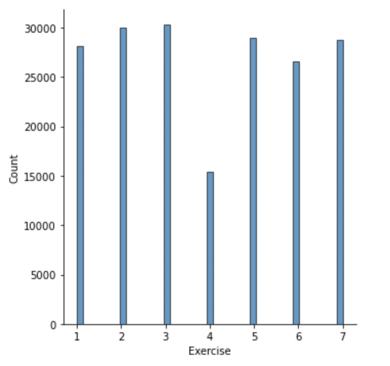
Next, some distribution graphs to understand the wider dataset:
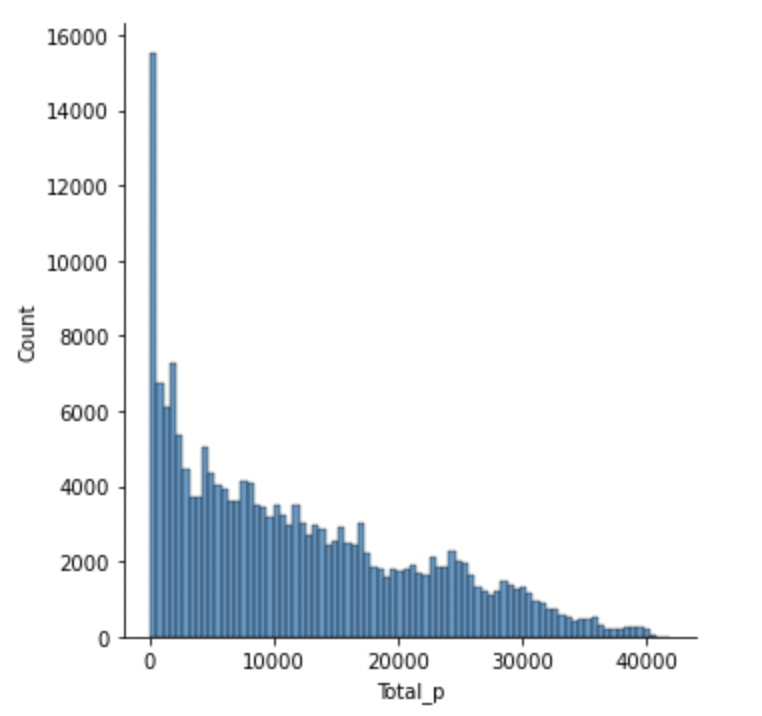
The most common total pressure for a given timestamp is zero i.e. when there is no subject on the mat (including jumps).
Because the exercises are dynamic over time, a still snapshot is not enough information for a model to classify the exercise by. Therefore I wanted to deduce whether each exercise had its own distinct pattern when plotted against time.
Plotting subplots for each exercise, showing the total pressure recorded against time.
Code to visualise total exercise pressure against time
# plotting total pressure against time

whichsubject = 1
whichexercise = 1
numexercise = 7

fig, ax = plt.subplots(numexercise)

for i in range(1,numexercise+1):
    exercise = pm_df.loc[(pm_df['Subject'] == whichsubject) & (pm_df['Exercise'] == i)]
    ax[i-1].plot(exercise.loc[:,'r_Time'], exercise.loc[:,'Total_p']) #plot relative time against total pressure
    #ax[i-1].get_yaxis().set_visible(False) #hide y axis
    ax[i-1].get_xaxis().set_visible(False) #hide x axis
    ax[i-1].title.set_text("Exercise {}".format(i)) #set titles per subplot according to exercise number
    plt.subplots_adjust(top=2, hspace=0.75) #adjust spacing between subplots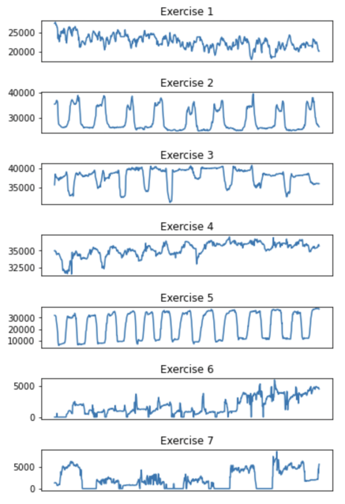
I was pleased to find a few of the exercises had distinctly repetitive patterns.
Feature Selection
I explored two methods of feature selection.
The first method was to manually calculate the approximate entropy (ApEn) of each feature. ApEn is a technique that measures the regularity and predictability of each dimension, which should in theory aid the selection of the most ‘useful’ sensors for a ML model.
Code to calculate ApEn
# define a function that calculates the approximate entropy
# from https://en.wikipedia.org/wiki/Approximate_entropy

def ApEn(U, m, r) -> float:
    """Approximate_entropy."""

    def _maxdist(x_i, x_j):
        return max([abs(ua - va) for ua, va in zip(x_i, x_j)])

    def _phi(m):
        x = [[U[j] for j in range(i, i + m - 1 + 1)] for i in range(N - m + 1)]
        C = [
            len([1 for x_j in x if _maxdist(x_i, x_j) <= r]) / (N - m + 1.0)
            for x_i in x
        ]
        return (N - m + 1.0) ** (-1) * sum(np.log(C))

    N = len(U)

    return abs(_phi(m + 1) - _phi(m))

# calculate the ApEn for each feature

column_apen = []

for i in tqdm(range(len(sub1ex2.columns))):
    column_apen.append(ApEn(sub1ex2.iloc[:,i].values, 2, 3))

#plot the distribution of ApEn values
sns.displot(column_apen)
I then compared ApEn results against an out-the-box feature selection module, the mutual information (MI) regression from sci-kit learn. This method is an example of univariate feature selection, whereby the best features are selected based on univariate statistical tests. We compare each feature (pressure reading of a specific sensor) to the target variable (total pressure), to see whether there is any statistically significant relationship between them. It is also called analysis of variance (ANOVA), commonly used in Biological applications, where I first came across this methodology.
Code to calculate MI
#calculating mutual information between each individual sensor result and the total pressure

from sklearn.feature_selection import mutual_info_classif

mutInf = sklearn.feature_selection.mutual_info_regression(sub1ex2.values, sub1ex2_df['Total_p'].values)

#plotting mutual information against number of features
sns.displot(mutInf)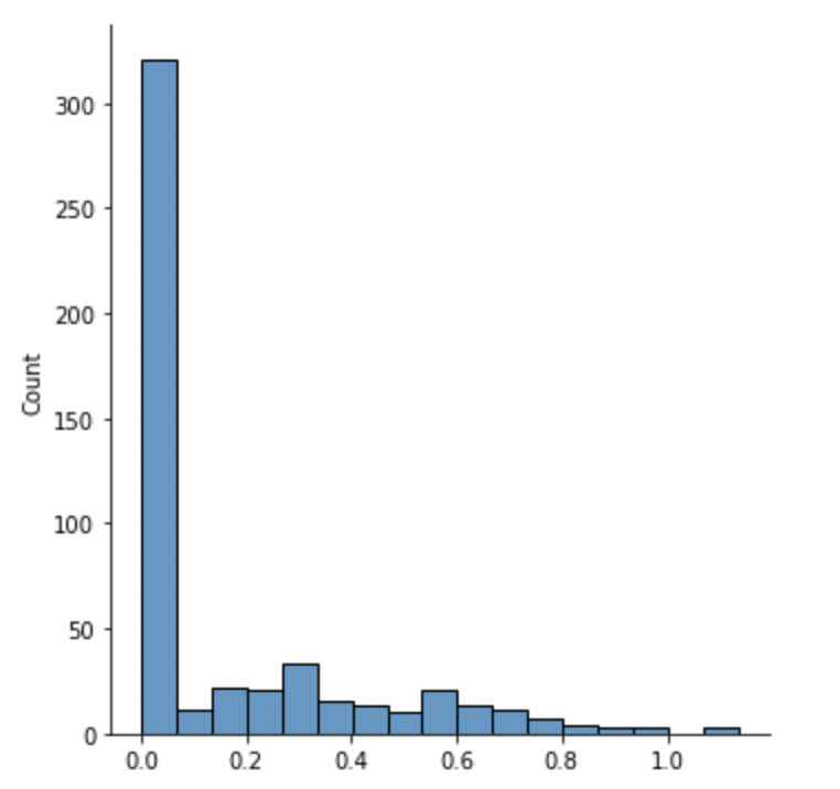
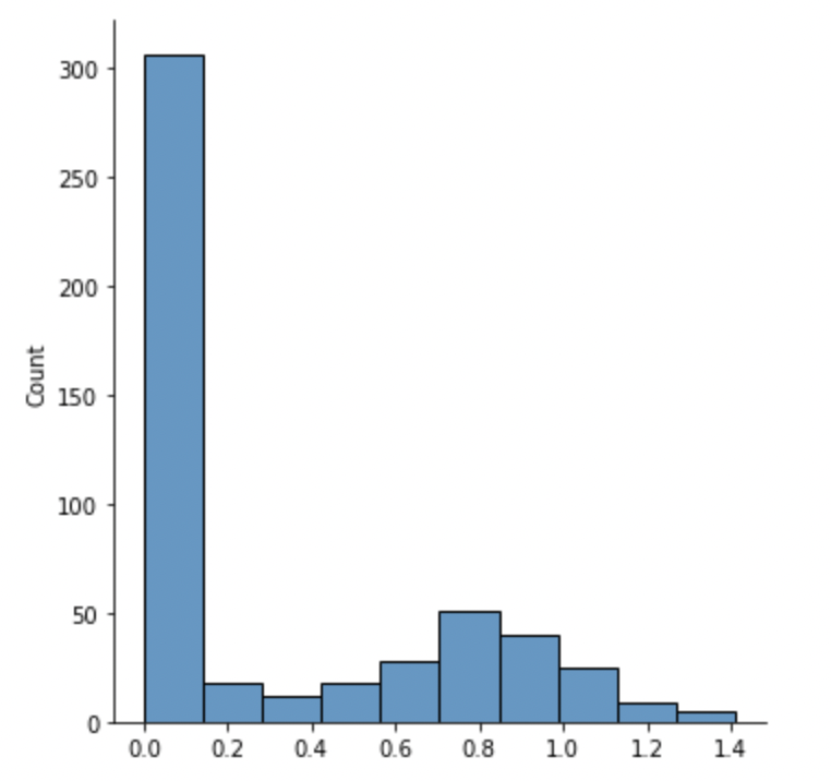
Over half of all features have an ApEn value of zero or near zero, meaning they are so regular that they are predictable all the time and offer no meaningful information.
Likewise, over half of all features show an MI of zero, indicating the features are independent of, and therefore have no impact on, the total pressure. A higher MI value indicates a higher dependency.
Code to apply feature selection to the dataset
#create a list of centiles that will be used to reduce the volume of features in the df

#100% of dataset reduced by 30% each time:
reduce = 0.3
current = 100
centiles = []

while current > 1:
    centiles.append(current)
    current = current * (1 - reduce)

#print(centiles)

from sklearn.neighbors import KNeighborsClassifier
from sklearn.model_selection import train_test_split, cross_val_score
from sklearn.feature_selection import SelectPercentile, mutual_info_classif

X = pm_df_fs #all the pressure sensor features
Y = pm_df['Exercise'] #the target i.e. exercise number

print(X.shape)

start = timer()

X_list = []

for i in tqdm(range(len(centiles))):
    X_list.append(SelectPercentile(mutual_info_classif, centiles[i]).fit_transform(X, Y))
    print("Number of features retained: {}".format(X_list[i].shape[1]))

end = timer()
dt = end - start
print("Feature selecting time elapsed: {:.2f}s".format(dt))
I applied the feature selection in a manner that creates 13 different datasets with a volume reduction of 30% each time. This way I can compare the ML performance of a model using all 512 features, against a model using only 358 features, then 251 features and so on. Each time removing the features deemed least useful.
Building ML Model and Results
How does feature selection within a large dataset affect the performance of a ML model to predict physical human activity?
In this dataset, the type of exercise being performed by the subject is our target to be predicted. Because this is a discrete data type, it forms an interesting classification problem.
The K-Nearest Neighbors classifier (KNN) was used in this analysis – it is a simple supervised machine learning algorithm which utilises observations within known classes (labeled data in our training set which tells us what pressure measurements are typical of which exercises). It then compares these against observations (pressure readings) with an unknown class – matching them according to proximity.
Code to build and run KNN model
from sklearn.metrics import confusion_matrix
from sklearn.metrics import classification_report

neigh = KNeighborsClassifier(n_neighbors=3)

fit_time = []
predict_time = []
reports = []

for i in range(len(centiles)): #for each volume of data
    start = timer()
    x_train, x_test, y_train, y_test = train_test_split(X_list[i], Y) #for each dataset in x_list (30% stepwise feature reduction), split the dataset into training and testing sets.
    neigh.fit(x_train, y_train) #run the training data through the KNN
    end = timer()
    fit_time.append(end - start) #record the training time. this will help us compare model performance
    print("Fitting time elapsed for {} columns: {:.2f}s".format(x_train.shape[1], fit_time[i]))

    start = timer()
    pred = neigh.predict(x_test) #run test data through our trained KNN to predict exercise performed
    end = timer()
    predict_time.append(end - start) #record the prediction time. this will help us compare model performance
    print("Predicting time elapsed: {:.2f}s".format(predict_time[i]))

    c_mat = confusion_matrix(y_test, pred) #compare the test predictions against the actual target (hidden to trained model). produce a confusion matrix.
    print("Confusion matrix:\n{}".format(c_mat))

    reports.append(classification_report(y_test, pred, output_dict = True)) #writes a report of results
    print(reports[i])

    print("\n\n")
The true intention of this analysis is to prove feature selection can improve the performance of a model, with additional computational benefits as a by-product. More information does not necessarily produce a more accurate model, due to noise and over-fitting.
The final step is to measure the levels of classification precision after reducing the sensor volume by 30% in a stepwise manner.
Code to plot KNN performance against dataset volume
#pull macro average precision results from the above reports into a list
macro_avg = []

for i in range(len(reports)):
    macro_avg.append(reports[i]['macro avg']['precision'])

t = list(range(len(centiles)))

numCol = []
for i in range(len(X_list)):
    numCol.append(X_list[i].shape[1])

fig, ax1 = plt.subplots()

color = 'tab:red'
ax1.set_xlabel('Number of Columns Used')
ax1.set_ylabel('Macro Average Precision', color=color)
ax1.plot(t, macro_avg, color=color)
ax1.tick_params(axis='y', labelcolor=color)

plt.xticks(t, numCol)

ax2 = ax1.twinx() #instantiate a second axes that shares the same x-axis

color = 'tab:blue'
ax2.set_ylabel('Prediction Time (s)', color=color)  #already handled the x-label with ax1
ax2.plot(t, predict_time, color=color)
ax2.tick_params(axis='y', labelcolor=color)

fig.tight_layout()  #otherwise the right y-label is slightly clipped
plt.show()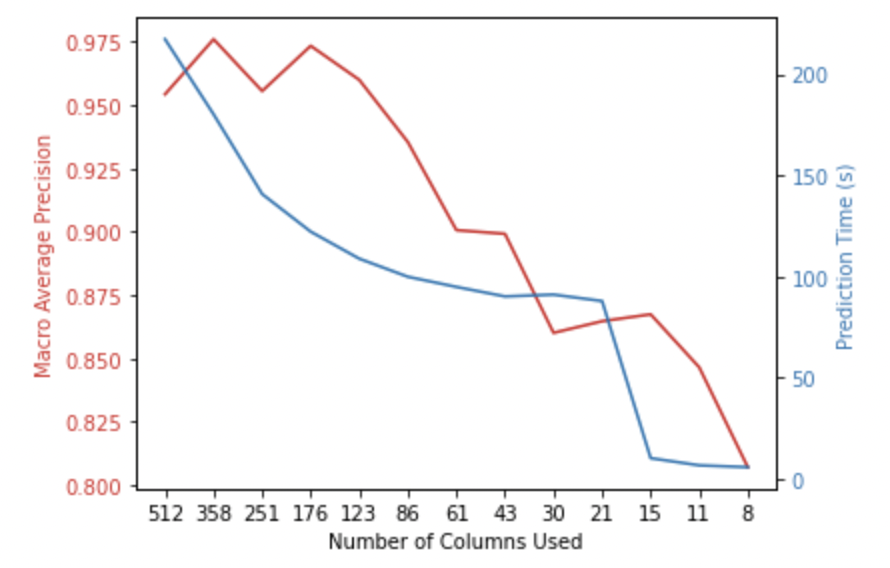
Ta-da! There is an immediate increase in the macro average precision of the model upon removing 30% of features from the dataset. In addition to this, the time taken to make a prediction has decreased.
All code for this analysis can be found on my GitHub repo here.
0 thoughts on “Feature Selection to Optimise Human Activity Recognition Model”